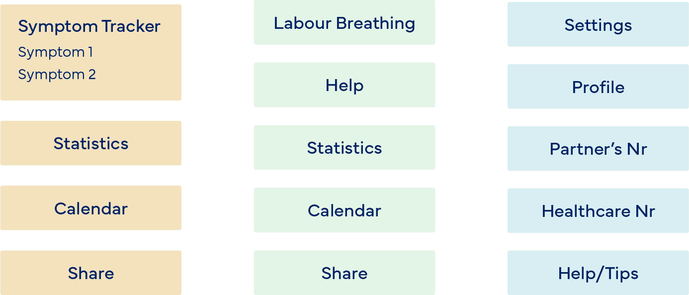
Assignment:

DTT

My Role:

User Researcher, Information Architect, Visual Designer

Doula

A virtual labour coach

Doula is a pregnancy app which provides audio guidance in the final phase of pregnancy for managing the pain during contractions. Additionally users can view statistics of their contractions. I was asked to develop a design solution for a new feature, and update the visual style and overall user experience.

View a detailed presentation of my re-design in this FigJam file.

mockups of a labour coaching app

Index

Research
Re-design

Audit

What's wrong?

The app requires a symptom tracker for expectant mothers . Additionally, the visual style of the app is outdated and not very engaging. Users have also reported feeling disconnected from the app and are looking for a more personal and supportive experience.

Research

Understanding the pain points

In order to identify the pain points of the current app, I created a short survey and sent it to 5 pre- and postnatal women. The survey included questions about age, pregnancy phase, previous experiences with apps, symptoms they wish to track, and feedback on the current app. I then conducted interviews with each participant.

Competitive Analysis

I identified several popular symptom tracking apps for women’s health, such as Ovia, Pregnancy+, and Clue. Clue's effective color-coding system and categorized symptom tracking stood out to me. Users can track symptoms in two ways: through a monthly overview with colored dots on the calendar and a detailed view for individual days. I chose to adopt Clue's method because it breaks down symptoms into smaller categories, making it easier for users to manage.

app screens clue

App Screens from Clue

card sorting

Architecture

‘Card sorting’ was helpful in determining the flow of the app, and I decided to narrow down the navigation options to 3; Health, Labour, and Settings. Further options are located within each of the corresponding sections.

Re-design

colour and typeface

Colour & type choice

Although the colours of the original Doula app negatively affected one survey respondent, the majority of responses were positive. I decided to change the primary orange hue slightly to increase legibility. Using lighter or darker tones of orange, and added shadows, elevations were created throughout, as suggested by the Material Design 3 guide. This adds depth to the design, and implies interactivity. The current type was illegible and inappropriate for body text. I chose the versatile, sans-serif typeface, Avenir, in various styles and sizes to create a hierarchy.

new screen

Re-designed labour screen

Navigation

Instead of the burger button at the top left of the app screens, I added a bottom navigation bar with 3 options. This is easier for the user to reach with their thumb, and ensures that they aren’t overwhelmed with buttons at first glance. The app is divided in 3 sections; Symptoms, Labour, and Settings.
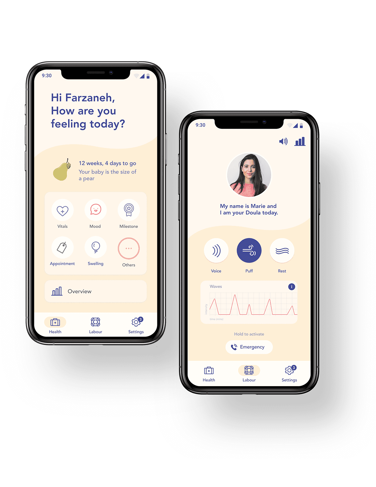
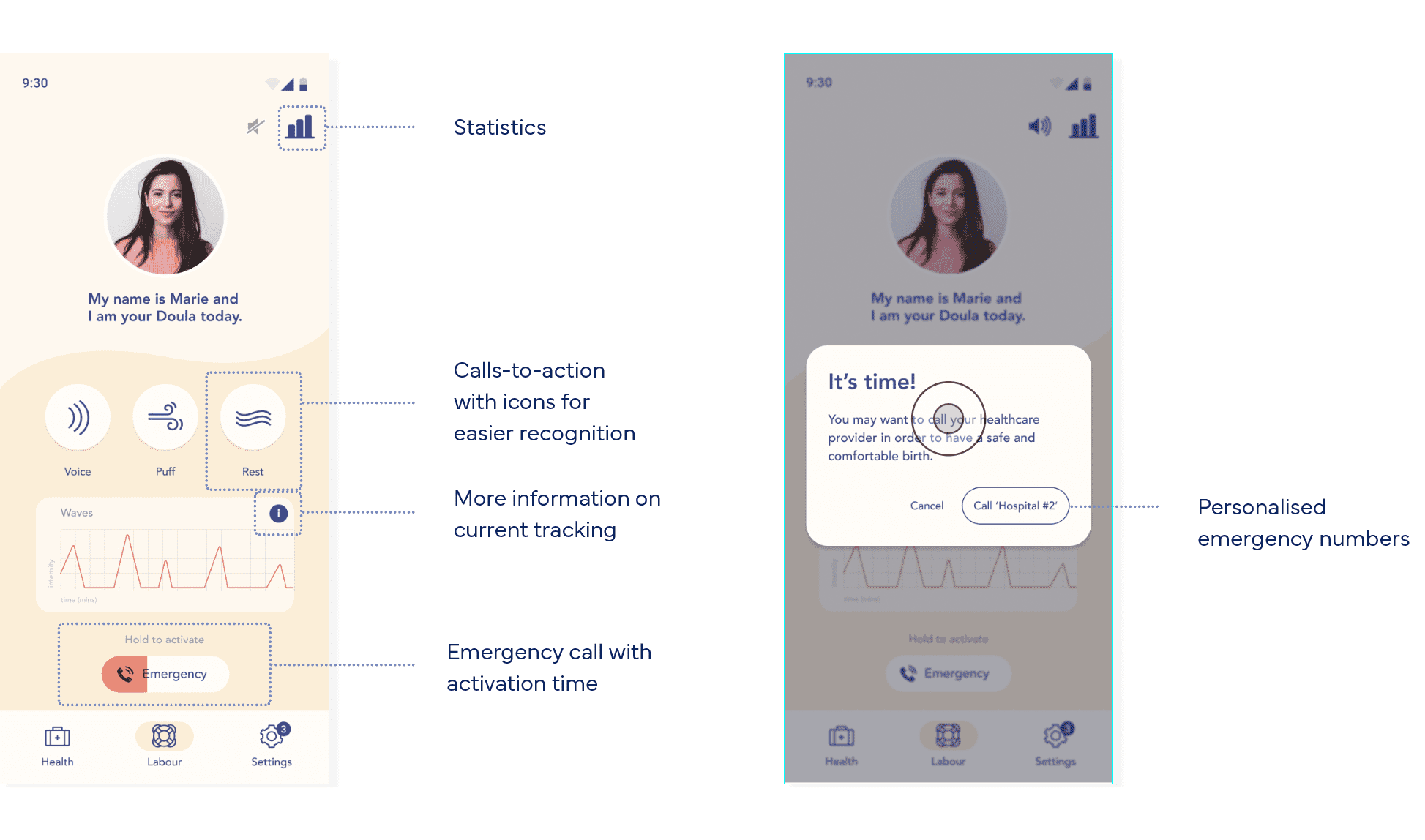
Labour Screen

I decided to add the portrait at the top of the screen, so that the user may feel more connected to their doula throughout the coaching. Furthermore, I used the word “doula” instead of coach, to retain semantic continuity. The background music may be muted at any time using the top bar, which also contains the statistics button. The biggest importance is still placed on the 3 buttons, Voice, Puff, and Rest, since this is the main purpose of the screen. After testing the screen with a user, I realised the need for an emergency call button. In order to avoid accidental calls, I decided to use a “hold to activate” interaction to the button. When activated, the button turns orange, which differentiates it from all other buttons in the app.

new screen

Symptom tracker

Users may add the colour-coded symptoms as shortcuts by tapping the "Add to dashboard" button. A button to the ‘Overview’ section takes the user to their logged history and its insights. Selecting a symptom takes them to the sub-categories, from which they can further choose. The history can be shared with a healthcare professional using the share button.